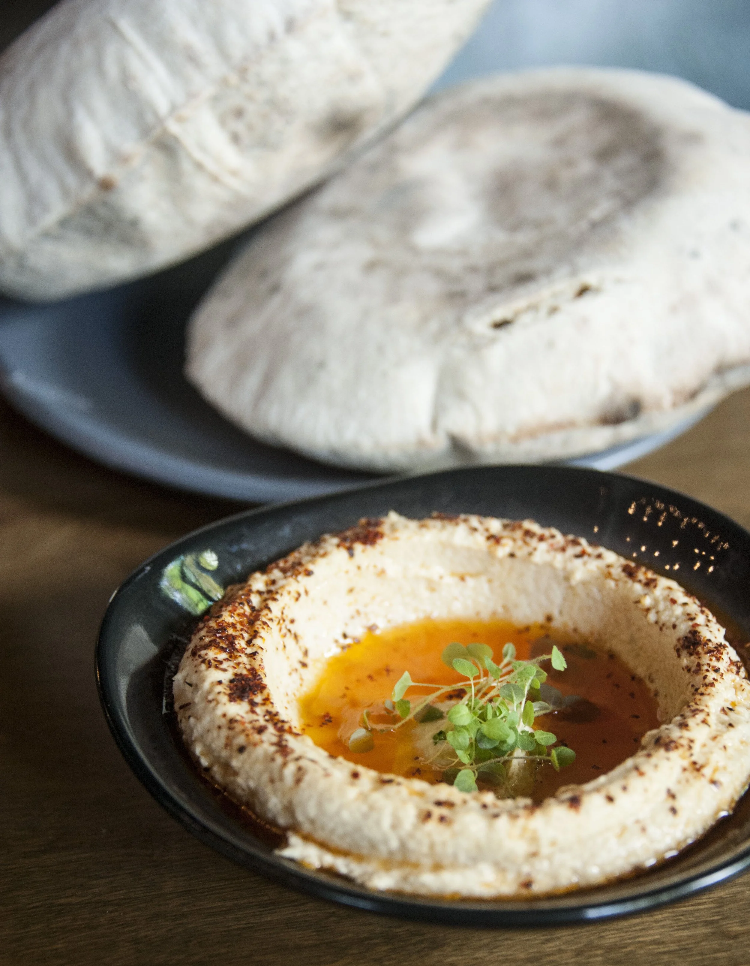
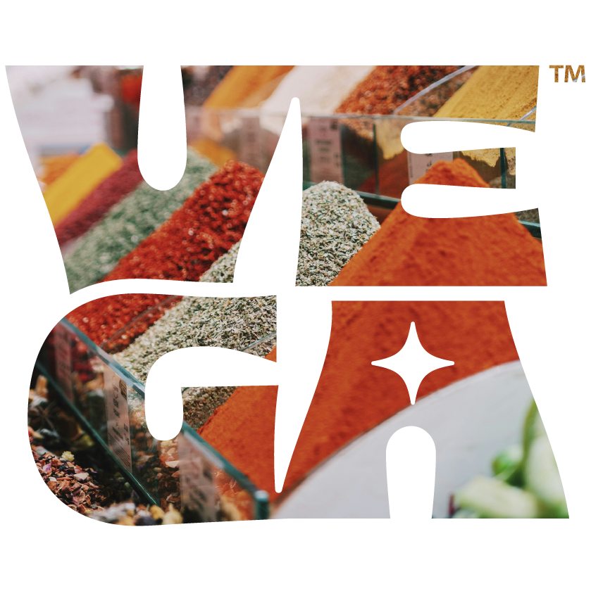
Vega Shawarma
Like most of our clients, Vega Shawarma came to us from a client referral. Having been successful with their first restaurant, Lyra in East Nashville, they were already working on developing their new fast casual concept, Vega Shawarma.
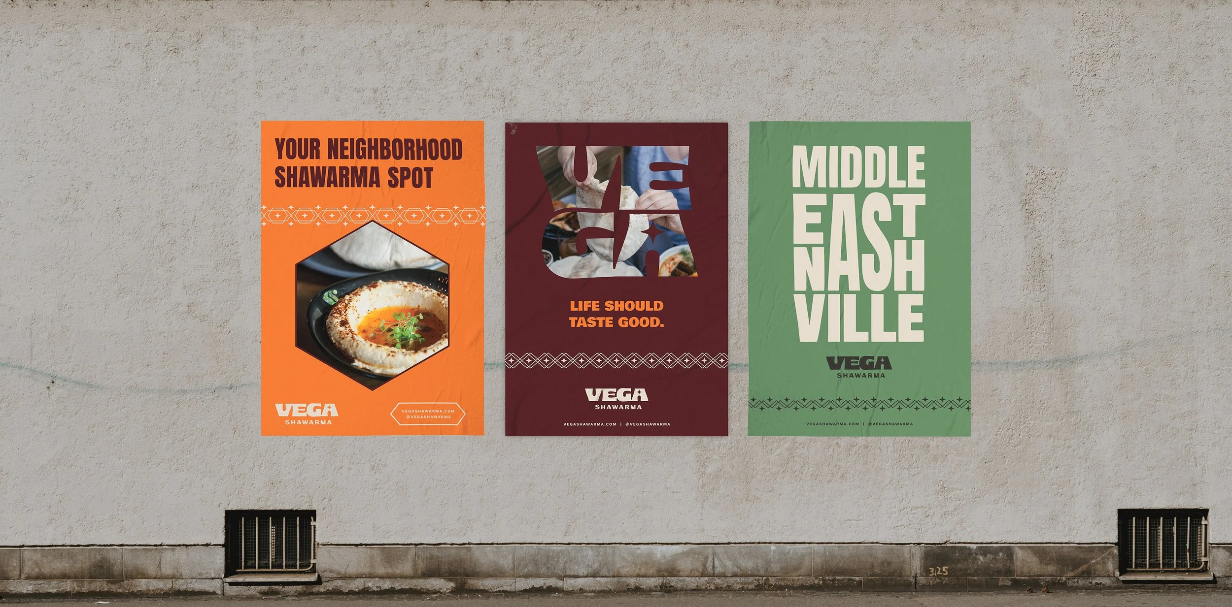
We took the established, sophisticated style of Lyra and translated it into the approachable and energetic enough for fast-casual. Their chosen name Vega - the brightest star in the constellation Lyra - gave us our answer. The astronomical connection honored the relationship between concepts while giving Vega its own distinct identity.
BRAND DEVELOPMENT
〰️
BRAND GUIDELINES
〰️
BRAND DEVELOPMENT 〰️ BRAND GUIDELINES 〰️


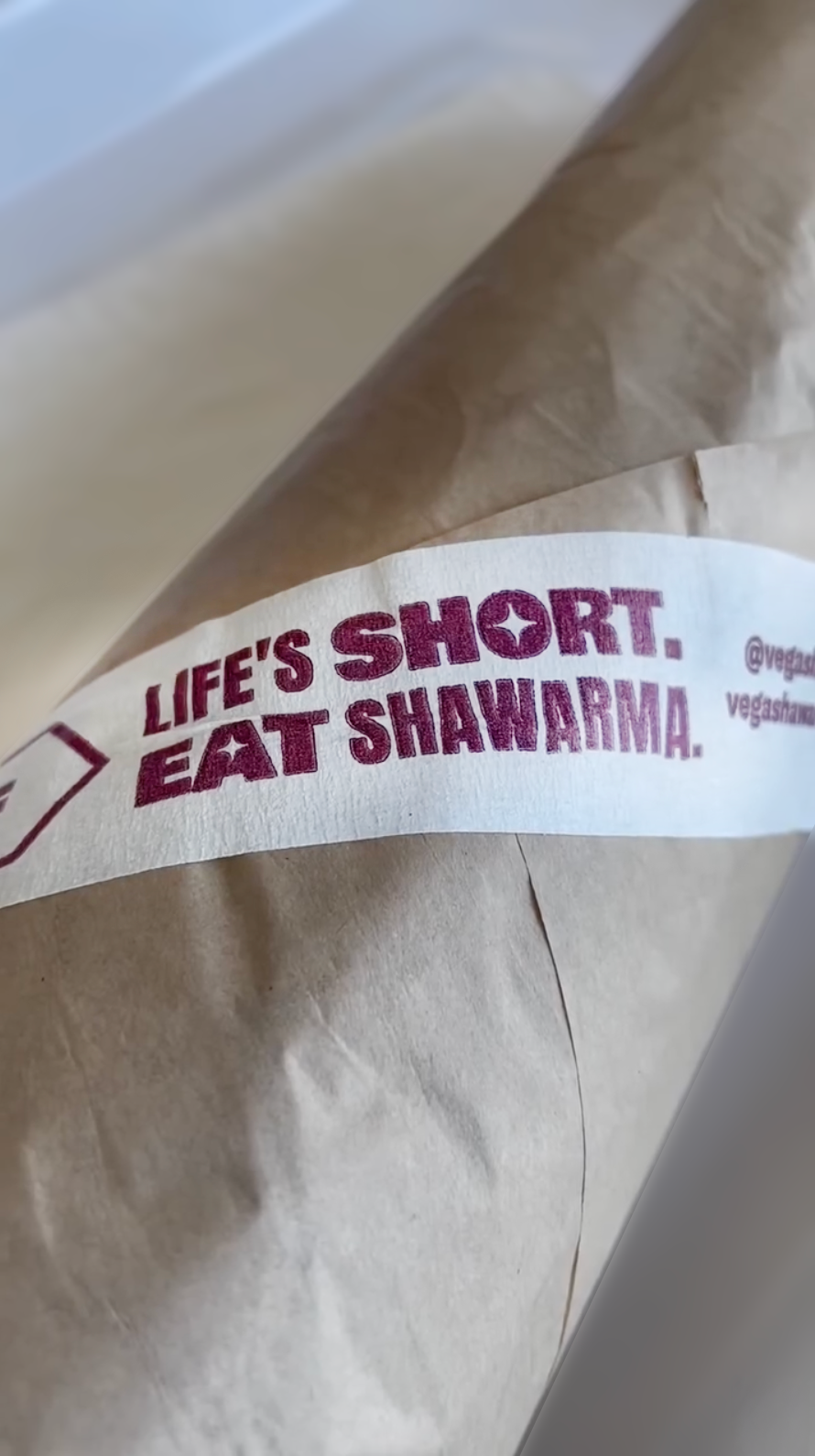

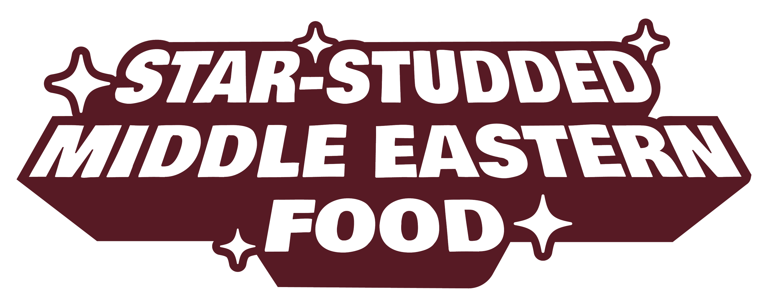
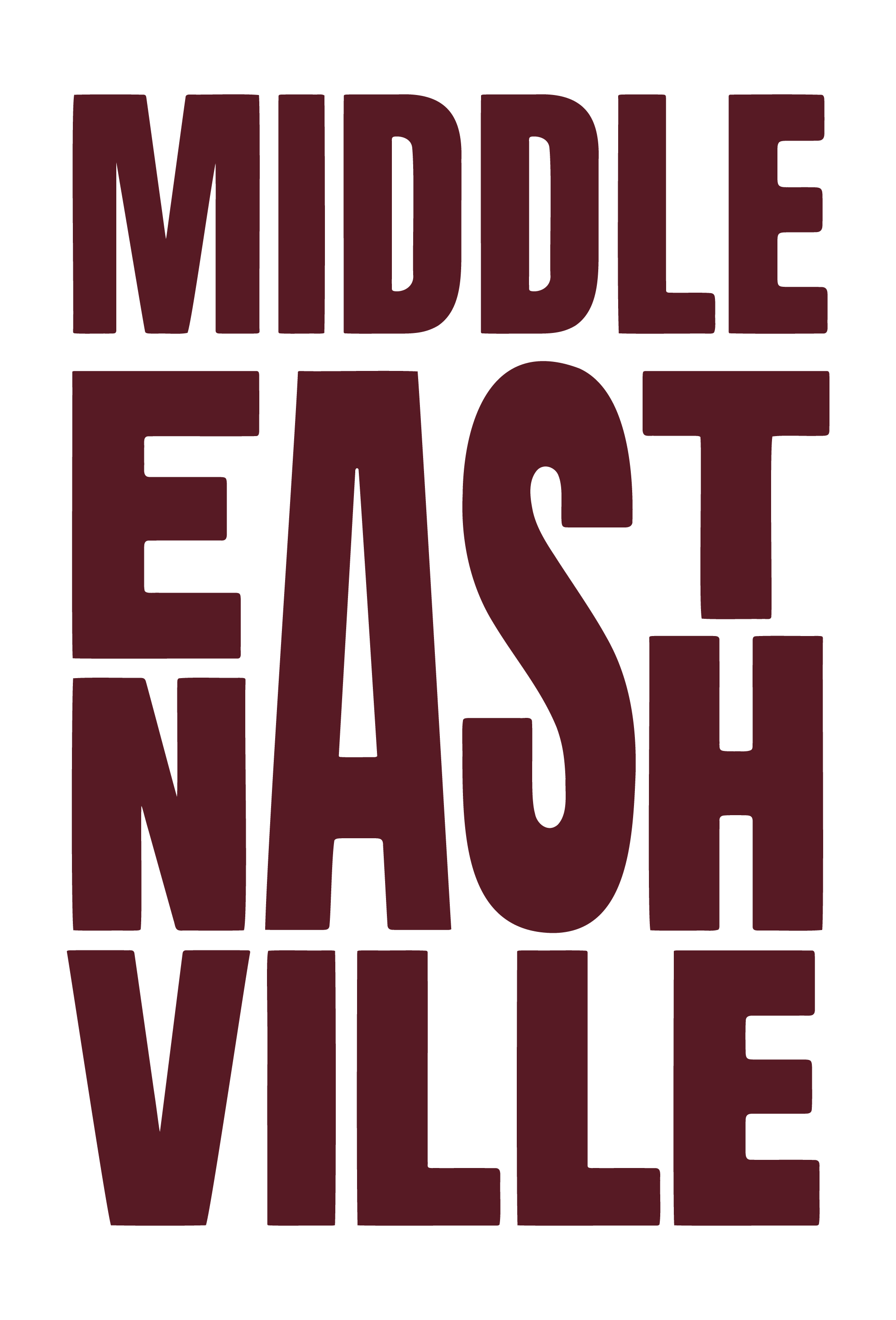
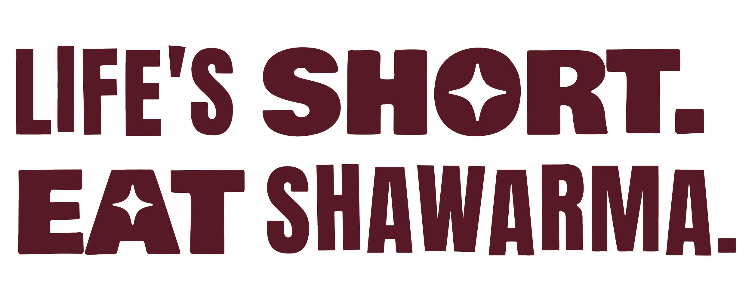


We developed a flexible visual system built around custom letterforms that could adapt across touchpoints, paired with a warm, inviting color palette that felt both elevated and accessible. Once armed with our toolkit, they took it and ran, applying it across signage, menus, packaging, and environmental graphics, creating a cohesive experience that complemented Lyra's brand while establishing Vega's own personality.


pomegranate molasses
Saffron
TOUM
Black Sesame
OLIVE OIL
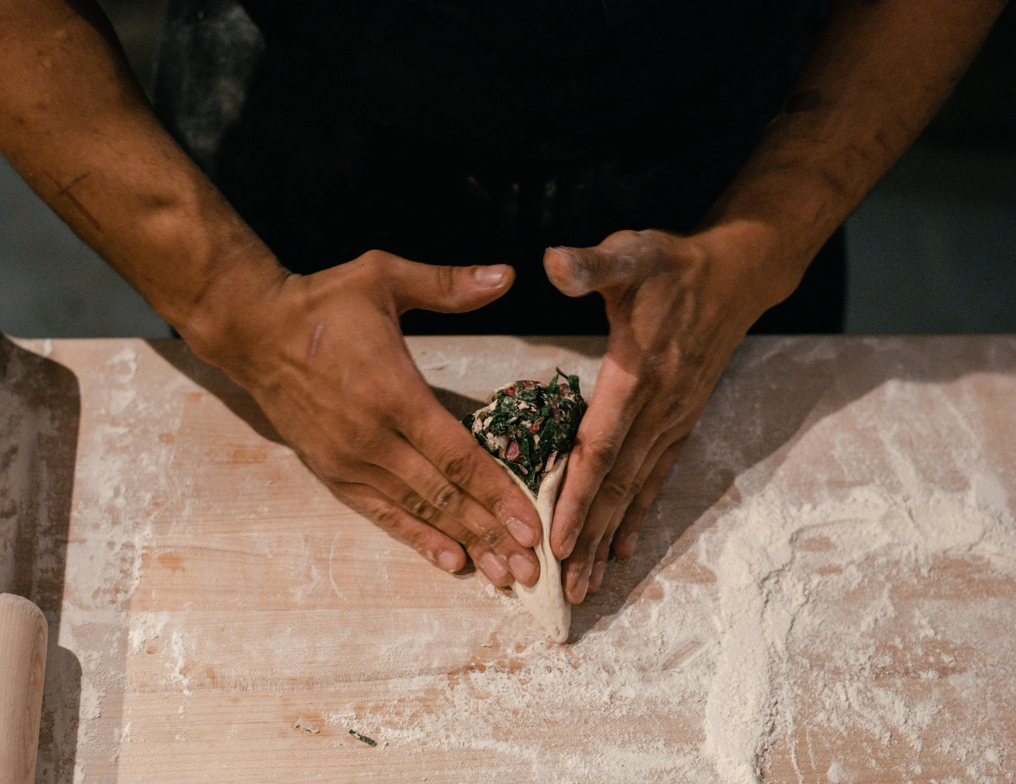
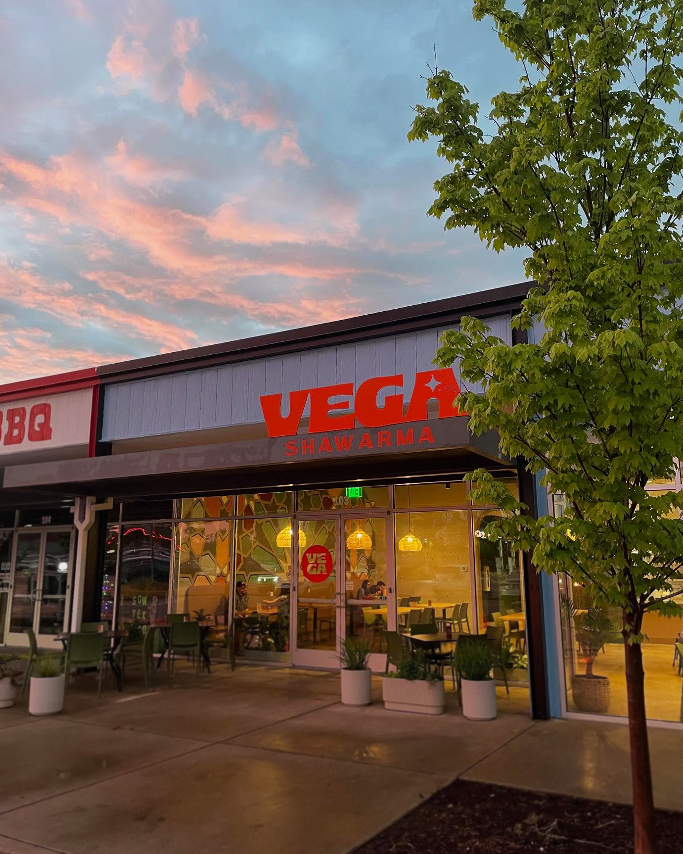
Since opening, Vega Shawarma has become a neighborhood fixture, proving that fast-casual doesn't mean sacrificing thoughtful design.